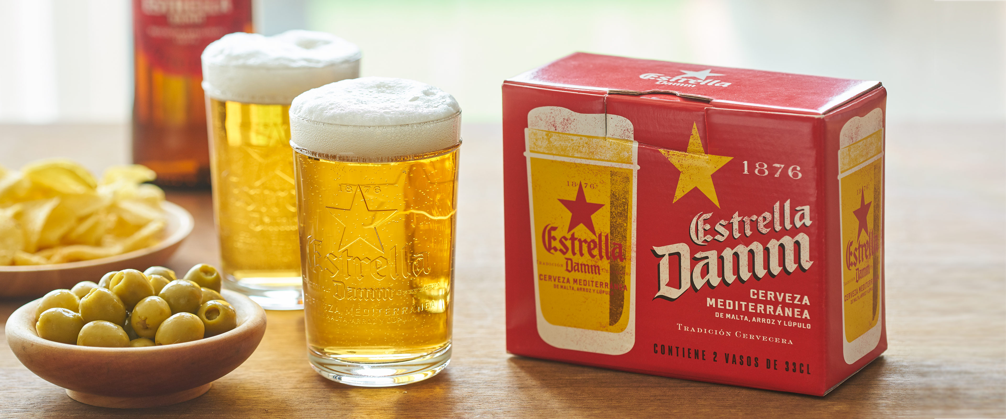
Paco Arará
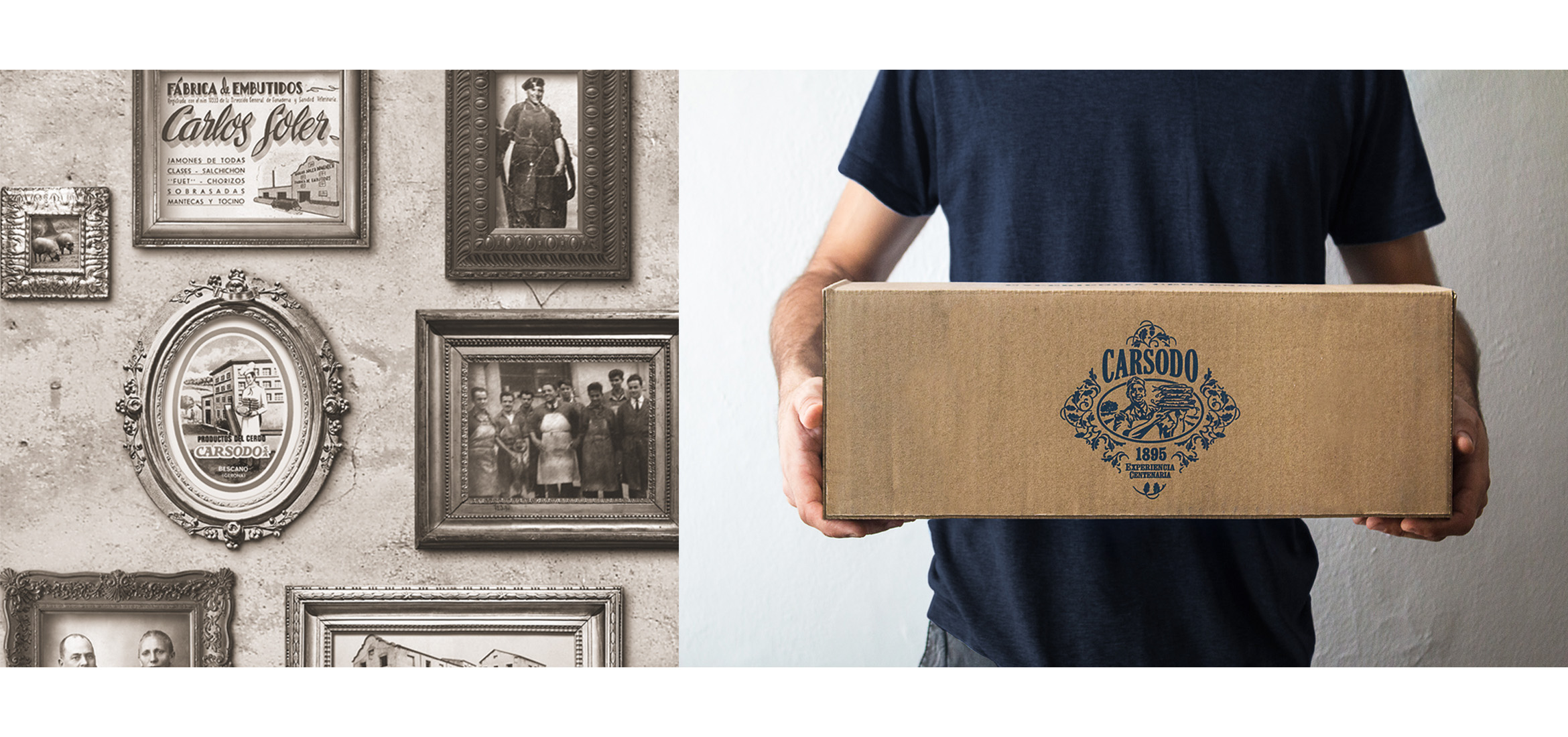
Through the origins we went back to those old charcuteries: Walls with white tiles mixed with tiles decorated with monochrome floral motifs.
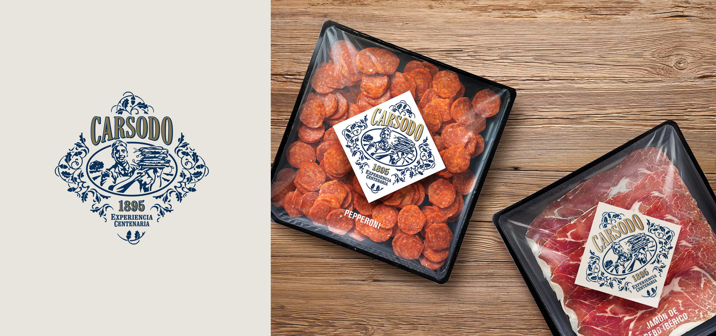
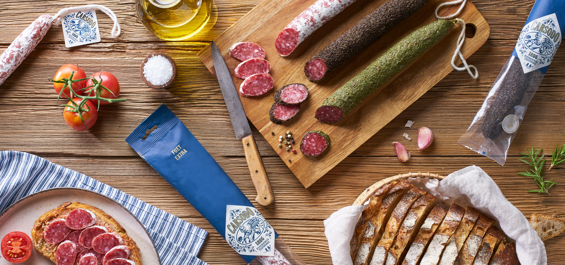
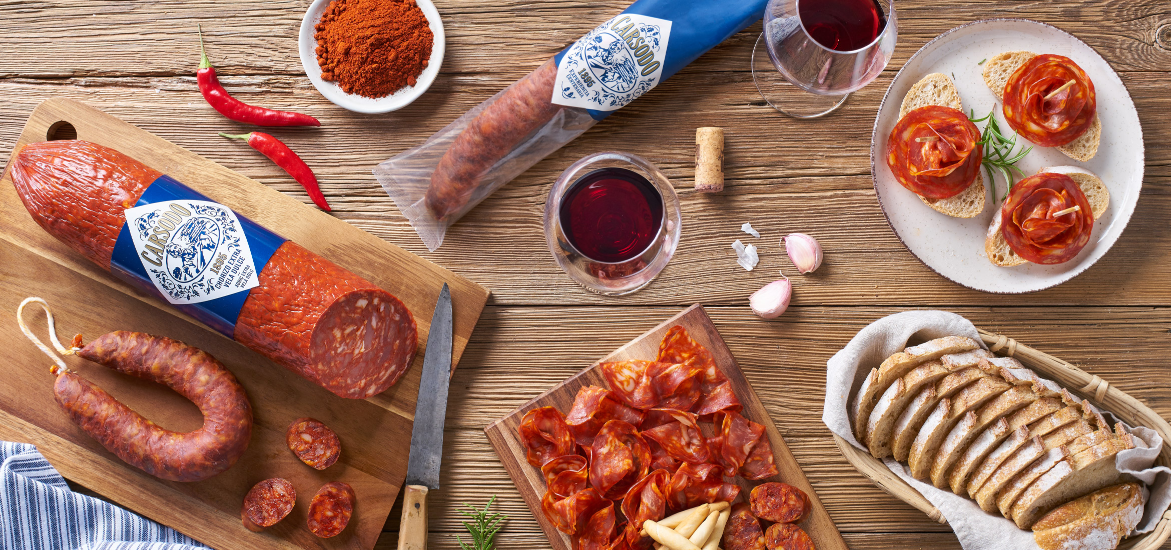
The nostalgia took us to those old packagings in which the seal, the brand, was the main and only message that a product needed to guarantee its quality. It is in this visual brand that we present the character of the label.
The idea came through the investigation of some of its packaging from the 50's and through the study of traditional packaging. A traditional packaging behaves in a concrete way: for the brands of the past, personalization was a guarantee. A professional butcher looks at the consumer and offers his products. We also wanted to replicate another clear example of the behavior of traditional packaging in the packages of sliced ham. Instead of creating a central window, we put the brand in the center. The brand certifies the quality of the product, in an authentic and honest way, and with the simplicity of a sober chromatic and the strength of a rhomboidal label.
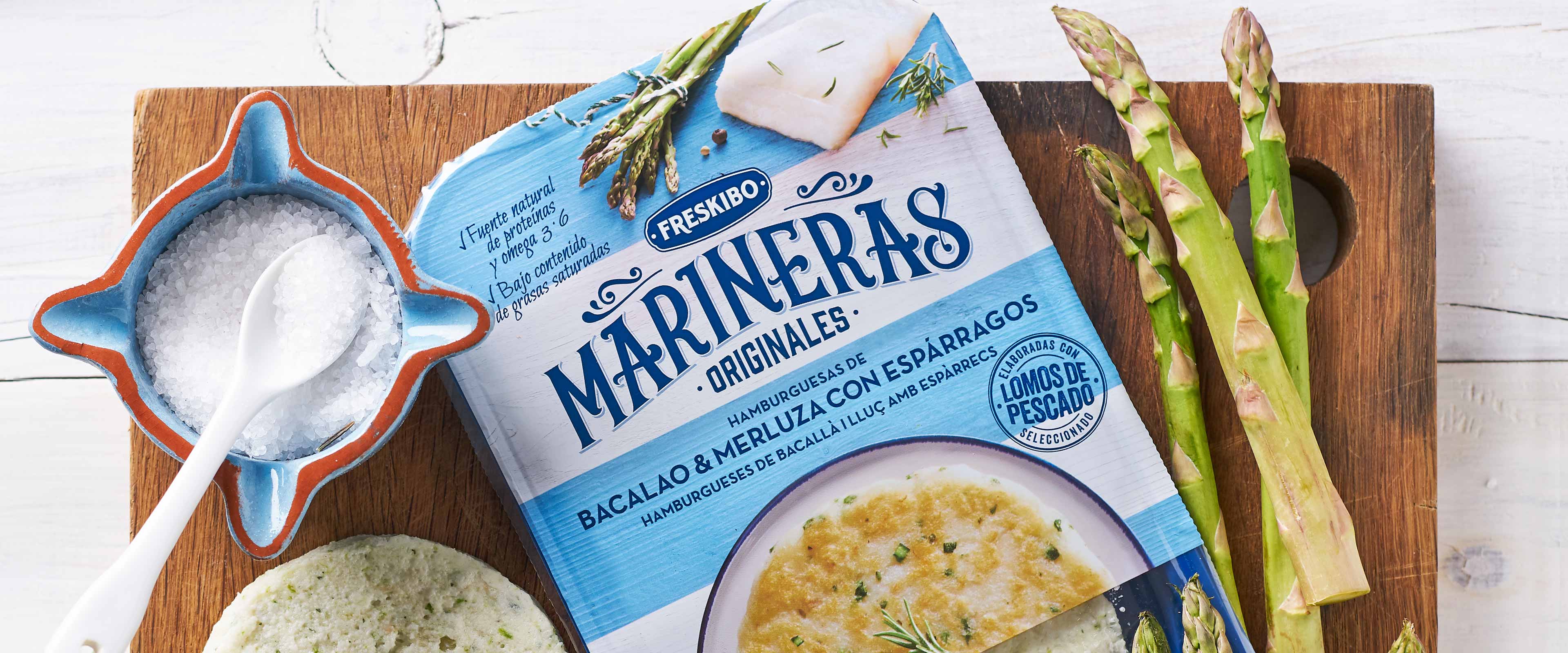
Freskibo
A whole new category of fish on the market
"Marineras, the first fishburger with its own name, began with Eva Estudi, and with it came the whole Freskibo product range. We always knew that defining an entirely new type of product was no easy task. We placed our trust in Eva Estudi to achieve it and we believe that, together, we are making a success of it, not just in terms of market results but also by increasing society’s consumption of fish” – Salvador Ros, managing partner of Freskibo
Eva Estudi
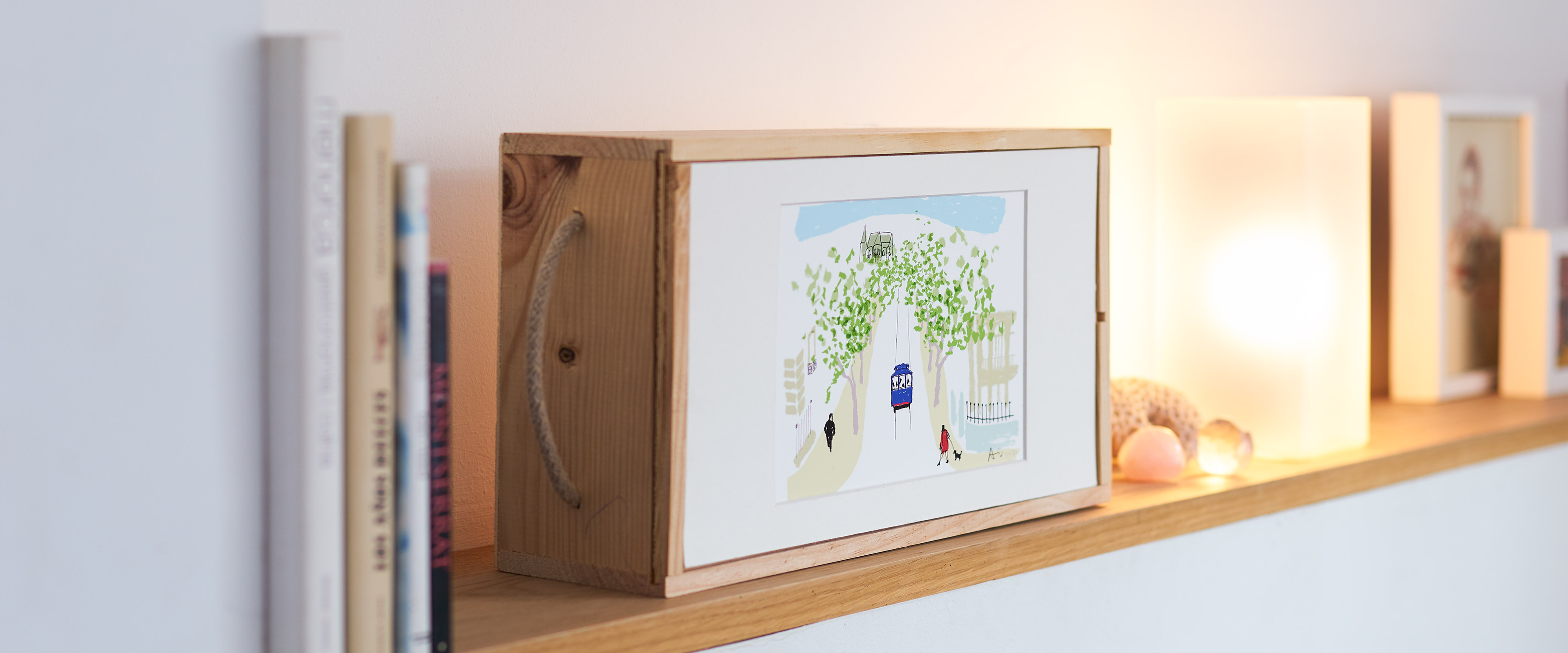
Eva Estudi’s 20th anniversary sustainable gift
Putting art on labels or making labels an art? With these two bottles of wine we wanted to celebrate our 20th anniversary in a different way, with a gift that begins to make sense gradually, as it is opened. A celebration gift in which nothing is superfluous and everything ends up as either art or wine.